The Deadline Is Here. The Risk Will Remain.
September 1, 2026 is the deadline for Canadian federally regulated financial institutions to reach full adherence to OSFI Guideline E-21.
Principle 6 asked institutions to map critical operations end to end across people, technology, processes, information, facilities, and third parties. That is much broader than drawing applications and connecting them. It describes everything the business needs in order to keep operating.
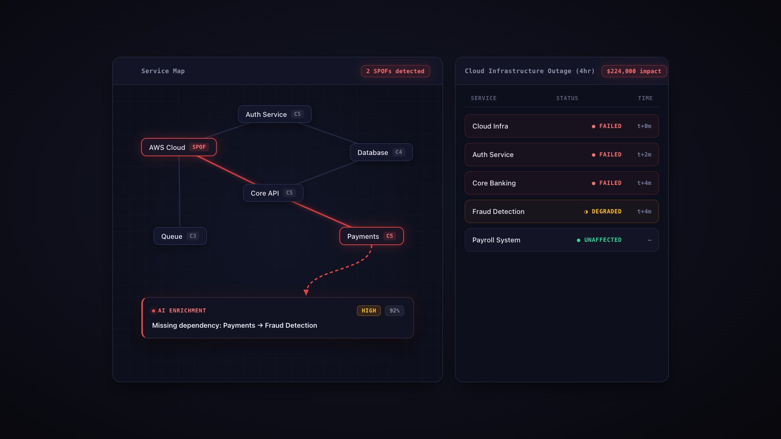
This is not another argument for dependency mapping. That argument has been won. The harder question is what the finished map still cannot show you, even when every box and arrow on it is accurate.
The UK gives us a useful preview of how this work actually lands. Its operational resilience transition ended on March 31, 2025, and one year later the FCA published its review:
“Mapping has been largely focused on technology used to support the delivery of important business services. However, firms should make sure they also include factors such as facilities, people, processes, information, and third-party resilience or testing outcomes.”
The FCA also found that firms had not mapped “the chain of fourth- and nth-party dependencies.” So the first lesson from the UK is that maps come out narrower than the requirement. The rules asked for the whole business, and firms mostly drew the technology.
But a second problem waits behind that one, and it does not go away when the inventory is finished. A map is naturally good at nouns. Server. Vendor. Database. Office. Fill in every category the FCA listed and you still have an inventory of nouns. What a map struggles with are verbs: what shares fate, who can change everything, how recovery happens, who must act, and what a customer can still accomplish while every dashboard is green.
Those verbs are where outages hide.
Two Vendors Can Be One Dependency
On the diagram, the payment processor and the KYC vendor are separate boxes. They have separate contracts and separate assurance packages. Both passed due diligence.
Underneath, they may use the same cloud region, the same DNS provider, or the same CDN. That is one dependency wearing two logos. Neither vendor has to be weak. Each can have a clean SOC 2 report and no troubling incident history. The risk only appears at the portfolio level, when several services that looked independent fail together.
This exposure can travel through several organizations before it reaches you. Your institution may not contract with the infrastructure provider at all. Your vendor does, or one of its vendors does. Your vendor box can be completely accurate and still leave out the platform that determines whether customers can use the service.
AWS US-EAST-1 showed the pattern at continental scale in October 2025. A race condition in DynamoDB's DNS automation cascaded through 141 AWS services over roughly 15 hours. Companies that ran nothing in us-east-1 still went down, because global AWS services, including IAM and CloudFront, concentrate in that region. Thousands of separate vendor boxes on thousands of maps turned out to share one dependency. Geographic diversity on the diagram did not produce independence underneath it.
Another vendor questionnaire will not reveal the pattern if every questionnaire is reviewed separately. The practical move is to cut the vendor list the other way. Pull the subservice organizations from SOC 2 reports and the names from subprocessor lists, then build a matrix of vendors against shared cloud, DNS, CDN, and other infrastructure. Do not look only for the weakest vendor. Look for the dependency that appears beneath several strong ones. The clusters are the finding.
Some Dependencies Carry Change
Most maps follow customer traffic. A request enters here, one service calls another, and data moves somewhere else. But some of the systems behind the largest blast radii carry no customer traffic at all. They carry change.
A configuration distributor, security content channel, authorization policy system, or deployment service has a standing write-path into many boxes at once. It can cross the regional and availability-zone boundaries that were meant to contain failure. The diagram may show three redundant regions. The control plane sees one fleet.
CrowdStrike is the sharpest example. On July 19, 2024, a routine content update called Channel File 291 activated a latent bug in the Falcon sensor's kernel driver, and about 8.5 million Windows machines entered blue-screen boot loops. Airlines, hospitals, and banks went down. CrowdStrike was used by more than half of the Fortune 500.
An endpoint security agent deployed across an organization's Windows machines is not part of one application. It sits underneath many of them, with an update channel that can change all of them at once. Application maps rarely show that write-path.
The shape keeps repeating. In June 2025, a bad configuration update propagated globally through Google Cloud's authorization infrastructure, and authentication failures reached Spotify, Cloudflare, and others. Regional separation in the data plane did not contain a change sent through a global control plane. Five months later, on November 18, 2025, a database permissions change at Cloudflare caused a Bot Management feature file to double in size past a hard limit. The oversized file propagated automatically to edge nodes around the world, and the distribution system delivered the same failure everywhere, efficiently.
For each critical node, ask what can push configuration, policy, content, credentials, or binaries into it. Then ask what else receives changes from the same source. The scope of that write-path belongs on the map alongside the traffic path, because redundancy does not protect you when the same hand can touch every copy.
The Fix Can Depend on the Failure
Production is one dependency chain. Recovery is another. Only the first tends to be mapped.
Facebook's October 4, 2021 outage made the second chain visible. A routine backbone maintenance command, waved through by a buggy audit tool, severed every inter-datacenter link. DNS servers responded as designed: after losing backbone connectivity, they withdrew their BGP routes. Facebook disappeared from the internet for about six hours.
The failure did not stop at production. Badge readers at data centre doors, out-of-band management tools, and internal communications all relied on the network that had failed. Engineers knew what needed to be fixed, but they could not get into the building to apply the fix.
Azure Front Door repeated the shape on October 29 and 30, 2025. A faulty control-plane configuration bypassed safety checks because of a defect in the deployment system. The outage lasted about nine hours and included the Azure Portal, one of the tools administrators needed to manage their infrastructure. Entra B2C identity failures widened the impact.
Take any critical node on the map and ask:
When this is down, does the thing we use to fix it depend on it?
Trace the answer all the way out: administrative access, privileged identity, internal communications, runbooks, building access, vendor escalation, out-of-band tools. Then test that chain while assuming the primary network or identity provider is unavailable. The recovery path deserves its own arrows because it becomes essential only after the production arrows have failed.
Your Incident Team Is Part of the Runtime
A dependency map with no people on it describes a company with no people in it.
A failover may require the one engineer who understands the runbook. That engineer may have left last quarter. A recovery step may need a hardware token kept in an office drawer. A production change may need an approval board that meets on Tuesdays. The vendor escalation contact may be current, but the phone number lives in a wiki behind the SSO that is down.
These are not administrative details beside the technical system. During an incident, they are runtime dependencies.
Adding a box labelled “People” does not solve the problem. Name the action. Who declares the failover? Who can approve it after hours? Where are the instructions? What authenticates the responder? Which facility holds the equipment?
If an action must occur for the service to recover, everything required to perform that action belongs in the model.
Green Boxes Can Mean a Broken Business
Topology maps encourage a simple state model: a node is up or it is down. Customers have more vocabulary.
A service can be slow enough to trigger retry storms. It can wait 30 seconds before failing, consuming more capacity than a clean rejection. It can return stale information. It can split into two contradictory states. Authentication can work while payments do not. Every component can report healthy while the customer remains stuck between them.
Rogers gave Canada a brutal demonstration on July 8, 2022. A routing update took down the carrier's network, and Interac debit was unavailable across the country for more than 14 hours. From inside a bank, almost every box was green that day. Core systems were up, branches were open, and Rogers did not appear on most application maps at all, because it sat a layer beneath the payment path. The customer standing at the terminal still could not pay.
That is why the critical operation, not the component, has to be the unit of testing. “Payment service available” describes a system. “Customer can complete a debit purchase” describes an outcome.
Test degraded behaviour, not only hard failure. Add latency. Return stale data. Make one channel unavailable while another remains healthy. Follow the customer journey across organizational boundaries and observe whether the operation still completes. A yellow node in the right place can produce a red business.
The Delta Is the Map You Need
The natural response to a blind spot is another review meeting. The same people project the same diagram and walk through it box by box. That can find a wrong arrow. It cannot reveal an arrow nobody thought to draw, because omissions are invisible by definition and inspection is a tool for finding errors, not absences.
The reliable way to find missing arrows is to break the model on purpose. Remove the cloud region beneath several vendors. Push a bad policy through the global control plane. Take away the identity service, then try to reach the recovery console. Make the expert unavailable. Slow the payment response instead of stopping it.
First record what the map predicts. Then run the scenario and observe what the critical operation does. The difference is not an embarrassment to hide before the report. It is the most valuable output of the exercise. The delta is your blind spot list.
OSFI has already set the next date: scenario testing across all critical operations is due September 1, 2027. Institutions can treat that work as another document to complete, or use it to challenge the assumptions inside the map they already have. I will be speaking about exactly these hidden dependencies at the DRI Canada Fall Symposium in Gatineau on November 12, 2026.
The map should change after every useful test. Feed current infrastructure data into the topology. Add the recovery and human dependencies the exercise exposed. Turn each unexpected result into a correction and a resilience backlog item. A living map is not one that moves boxes automatically. It is one that gets less wrong when reality teaches you something.
This is what we are building Failcast to do: maintain a living dependency map from real infrastructure data and simulate failure cascades against it. You can explore the basic idea in the free simulator.
The regulator got the map onto the table. Now we have to find out what it cannot see.
Related Reading
- What Is Infrastructure Dependency Mapping? A Complete Guide
- Nobody Wants to Own the Dependency Map (And That's Why It's Always Wrong)
- Your RTO Is a Lie: Recovery Time Objectives Are Chains, Not Numbers
- What Is Operational Resilience Modeling? From Compliance to Continuous Confidence
- The Rogers Outage: What It Taught Canada About Operational Resilience
- OSFI, Operational Risk Management and Resilience Guideline
- FCA, Operational Resilience Insights and Observations One Year On
- Meta Engineering, More Details About the October 4 Outage
- CrowdStrike, Falcon Content Update Preliminary Post-Incident Report
- Cloudflare, November 18, 2025 Outage
- Google Cloud, June 2025 Incident Report
- AWS, Post-Event Summaries